Analyzing my Facebook Messages
CIS 545 Final Project
By Grace Jiang | View Source Code Here
Introduction
I've been using Facebook as my primary means of communicating with my friends and family since 2012. I decided to analyze my messaging habits and history over the past 8 years using Pandas.
This project interests me since I want to analyze how frequently I talk to different friends throughout different periods of my life, as well as different metrics such as the average "duration" of my close friendships, how the language I have used has changed over time, and my "happiness" trends based off NLP analysis. My ultimate goal is to learn more about my messaging habits over the years.
This project is open source, meaning anyone who downloads their own Facebook messenger data and uses my code should also be able to look at their own messaging trends over the years!
1. Data Acquisition & Cleaning
Facebook allows its users to download their user data in their settings tab. The data comes as one large folder that contains one folder per conversations, and each of those folders contain one or more json files that store the conversation history.
I loaded all the data into one big dataframe by looping through the root directory and reading in any files that matched the "*.json" extension.
xfiles_path = 'messages/inbox/'all_msgs = pd.DataFrame()for root, dir, files in os.walk(files_path): for json_file in fnmatch.filter(files, "*.json"): file_url = root + '/' + json_file if not ('file' in file_url): with open(file_url) as json_data: data = json.load(json_data) print(file_url) curr_json_df = json_normalize(data, 'messages') all_msgs = pd.concat([all_msgs, curr_json_df])
Afterwards, I did some basic data cleaning such as dropping NaN values and type-conversion in my date columns.
xxxxxxxxxx# drop nan valuesall_msgs = all_msgs.dropna(subset=['content'])# convert timestamp to datetime formatall_msgs['datetime'] = all_msgs.apply(lambda row: datetime.datetime.fromtimestamp(int(row.timestamp_ms) * 0.001), axis = 1) # separate date and time from datetimeall_msgs['date'] = [d.date() for d in all_msgs['datetime']]all_msgs['month'] = [d.month for d in all_msgs['datetime']]all_msgs['year'] = [d.year for d in all_msgs['datetime']]all_msgs['time'] = [d.time() for d in all_msgs['datetime']]# select only certain columnsall_msgs = all_msgs[['sender_name', 'date', 'month', 'year', 'time', 'content', 'reactions', 'datetime']]# rename column sender_name to nameall_msgs = all_msgs.rename(columns={'sender_name': 'name'})# sort by datetimeall_msgs = all_msgs.sort_values(by=['datetime'])
Finally, after loading all my data into one big fat dataframe, I was ready to analyze my messaging history!
2. Basic Metric Analysis
I started off by measuring some different metrics of my messaging history, such as the number of messages I've sent and received, as well as how many total conversations I've had with different people.
Total Number of Messages in All Conversations: 2,732,052
Total Number of Messages Sent: 1,287,000
Total Number of Messages Received: 1,445,052
Number of Different Conversations: 2,557
Most Messages Received From Contacts:
- M.W. (288,850)
- A.C. (68,547)
- C.G. (59,101)
- R.L. (48,384)
- O.H. (45,573)
3. Diving a Little Deeper & Close Friends
After looking at the the statistics from my basic metric analysis, I decided I wanted to analyze my messaging habits over the years more closely.
(1) Grouping Messages Sent/Received by Year
xxxxxxxxxx# plot total number of messages sent & received per year over timefig, ax = plt.subplots()# total number of messages sent & receivedplot_all_msgs_df = all_msgs.groupby(['year'], as_index=False).agg({'content': 'count'})# number of msgs i sentplot_sent_msgs_df = my_msgs_df.groupby(['year'], as_index=False).agg({'content': 'count'})# number of msgs i receivedplot_received_msgs_df = other_people_df.groupby(['year'], as_index=False).agg({'content': 'count'})
(2) Plotting the Results
xxxxxxxxxxax.plot(plot_all_msgs_df['year'], plot_all_msgs_df['content'], label='total messages')ax.plot(plot_sent_msgs_df['year'], plot_sent_msgs_df['content'], label='messages sent')ax.plot(plot_received_msgs_df['year'], plot_received_msgs_df['content'], label='messages received')plt.title("messages sent & received over time", loc='center', fontsize=14, fontweight=0, color='black')ax.set_xlabel("year")ax.set_ylabel("number of messages")ax.legend(loc='best')
Total Messages Sent and Received Over Time
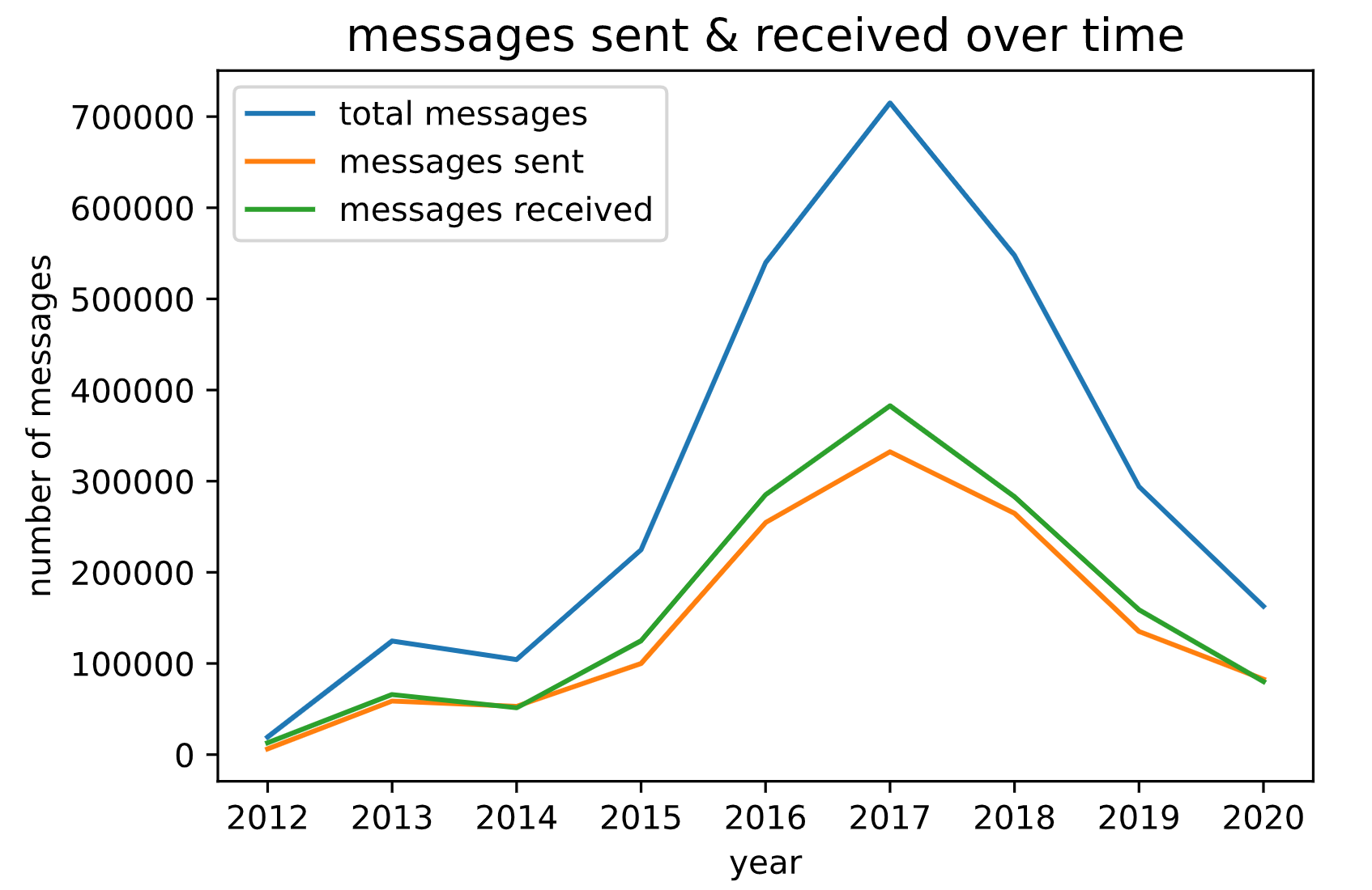
Interesting! I was also curious on seeing who exactly I was messaging at these specific periods of time, so I decided to also breakdown my data by person. Because I had over 2,500 conversations, most of which were under 100 messages, I also decided to filter my conversations to include only "close friends", which I arbitrarily defined as anyone who sent me over 25,000 messages (which meant that we would have roughly 50,000 total messages together).
xxxxxxxxxx# count messages per person per month & year# only include people with at least 25k messages received (~50k total messages, indicating significant talking)close_friends_series = msgs_per_person[msgs_per_person >= 25000]close_friends = set(close_friends_series.index)for friend in close_friends: print(friend)## filter messages to include only close friends#close_friends_df = other_people_df[other_people_df['name'].isin(close_friends)]
Again, the next step was to graph my results:
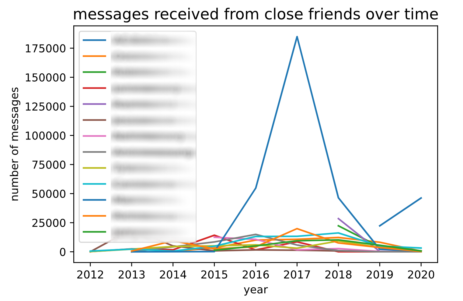
xxxxxxxxxx# plot number of messages exchanged with my close friends over timefig, ax = plt.subplots()plot_cf_df = close_friends_df.groupby(['year', 'name'], as_index=False).agg({'content': 'count'})for name in close_friends: ax.plot(plot_cf_df[plot_cf_df.name == name].year, plot_cf_df[plot_cf_df.name == name].content,label=name)plt.title("messages received from close friends over time", loc='center', fontsize=14, fontweight=0, color='black')ax.set_xlabel("year")ax.set_ylabel("number of messages")ax.legend(loc='best')
Messages Received Over Time, Broken Down By Person
...And After Removing Outliers...
Code to remove any outliers:
xxxxxxxxxxoutlier_name = 'Name Here' # edit this line of code to include your outlier's name# graph excluding outlierexcluding_outlier = close_friends.copy()excluding_outlier.remove(outlier_name)excluding_outlier_df = other_people_df[other_people_df['name'].isin(excluding_outlier)]fig, ax = plt.subplots()plot_cf_df = excluding_outlier_df.groupby(['year', 'name'], as_index=False).agg({'content': 'count'})for name in excluding_outlier: ax.plot(plot_cf_df[plot_cf_df.name == name].year, plot_cf_df[plot_cf_df.name == name].content,label=name)plt.title("messages received from close friends excluding outliers", loc='center', fontsize=14, fontweight=0, color='black')ax.set_xlabel("year")ax.set_ylabel("number of messages")ax.legend(loc='best')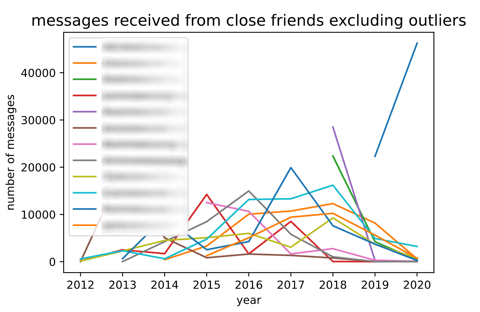
Language Usage Over Time
Finally, I wanted to analyze how the language I've used has changed over the years. I decided that the best way to do this was by using word clouds to visualize what words and phrases I used most frequently throughout the different years. (I also wrote code that told me what specific phrases I used the most, but as you can probably tell, I really like visual representations!) I did this by:
(1) Filtering the dataframe to only include messages that I sent in a certain year
xxxxxxxxxxmy_msgs_2012 = my_msgs_df[my_msgs_df['year'] == 2012]my_msgs_2013 = my_msgs_df[my_msgs_df['year'] == 2013]my_msgs_2014 = my_msgs_df[my_msgs_df['year'] == 2014]my_msgs_2015 = my_msgs_df[my_msgs_df['year'] == 2015]my_msgs_2016 = my_msgs_df[my_msgs_df['year'] == 2016]my_msgs_2017 = my_msgs_df[my_msgs_df['year'] == 2017]my_msgs_2018 = my_msgs_df[my_msgs_df['year'] == 2018]my_msgs_2019 = my_msgs_df[my_msgs_df['year'] == 2019]my_msgs_2020 = my_msgs_df[my_msgs_df['year'] == 2020]
(2) Importing stopwords, as well as adding some of my own
xxxxxxxxxxnltk.download('stopwords')stopwords = nltk.corpus.stopwords.words('english')stopwords.extend(['ur', 'u', 'like', 'ok', 'im', 'yea', 'â', 'dont', 'oh', 'yeah', 'idk', 'also', 'thats', 'i', 'and', 'the', 'a', 'but', 'so', 'then', 'bc', 'cuz'])
(3) Splitting each message into a list of words, and adding each word to an overall words list
xxxxxxxxxxdef generate_words_list(df): # split content into lists of words split_words = df.content.str.lower().str.split() split_words_df = pd.DataFrame(split_words) # iterate through each word and add word to all_words_list all_words_list = list() for index, row in split_words_df.iterrows(): if (type(row.content) == list): for word in row.content: if word not in stopwords: all_words_list.append(word) return all_words_list
(4) Generating a wordcloud using the word list
xxxxxxxxxxdef generate_wordcloud(df, title): all_words_list = generate_words_list(df) wordcloud = WordCloud( width = 1500, height = 1000, background_color = 'black', stopwords = STOPWORDS).generate(str(all_words_list)) fig = plt.figure( figsize = (40, 30), facecolor = 'k', edgecolor = 'k') plt.imshow(wordcloud, interpolation = 'bilinear') plt.axis('off') plt.tight_layout(pad=0) plt.title(title, loc='center', fontsize=80, color='white') plt.show()
Here were the final results!
2012 Word Cloud
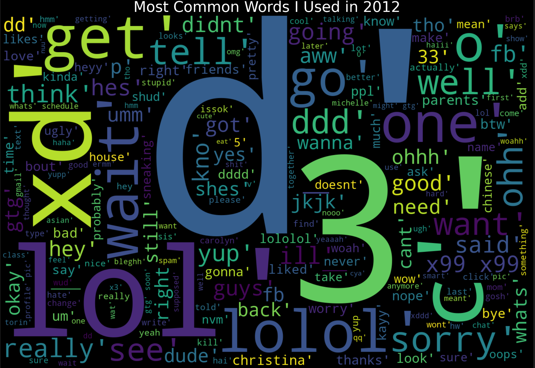
Note: The 'd' and '3' are most likely from 12-y/o me using ':D' and ':3' emoticons excessively
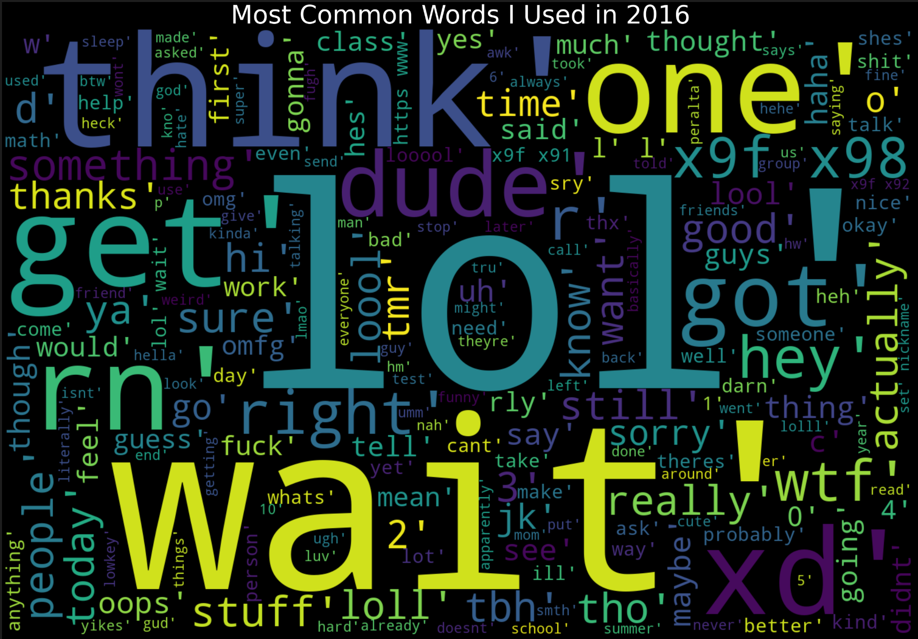
2016 Word Cloud
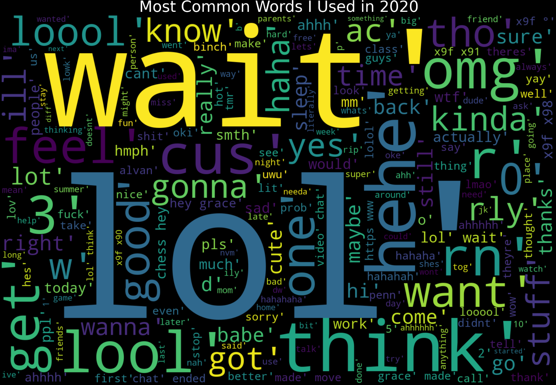
2020 Word Cloud
4. NLP & Sentiment Analysis
Happiness Trend over the Years
After seeing the different language I've used over the years, I thought it would be interesting to analyze the general sentiment in my language. The messages I sent at the time are probably a good indicator of how positive/happy I was feeling at the time, so this would be a cool way to analyze how my happiness levels have changed over the years.
After looking up several libraries online, I decided that the easiest way to do this was by using the library TextBlob.
(1) Analyzing Sentiment from a Dataframe
xxxxxxxxxxfrom textblob import TextBlobdef find_sentiment_analysis(df): sentiment = 0.0 num_msgs = 0.0 for row in df.content.str.lower(): blob = TextBlob(row) sentiment += blob.sentiment.polarity num_msgs += 1 return sentiment / num_msgs * 100.0
(2) Graphing the Dataframe
xxxxxxxxxxsentiment_analysis = []sentiment_analysis.append(find_sentiment_analysis(my_msgs_2012))sentiment_analysis.append(find_sentiment_analysis(my_msgs_2013))sentiment_analysis.append(find_sentiment_analysis(my_msgs_2014))sentiment_analysis.append(find_sentiment_analysis(my_msgs_2015))sentiment_analysis.append(find_sentiment_analysis(my_msgs_2016))sentiment_analysis.append(find_sentiment_analysis(my_msgs_2017))sentiment_analysis.append(find_sentiment_analysis(my_msgs_2018))sentiment_analysis.append(find_sentiment_analysis(my_msgs_2019))sentiment_analysis.append(find_sentiment_analysis(my_msgs_2020))my_sentiments_df = pd.DataFrame({'sentiment': sentiment_analysis}, index=[2012, 2013, 2014, 2015, 2016, 2017, 2018, 2019, 2020])my_sentiments_df.plot.line()
Here were the results!
Happiness Chart
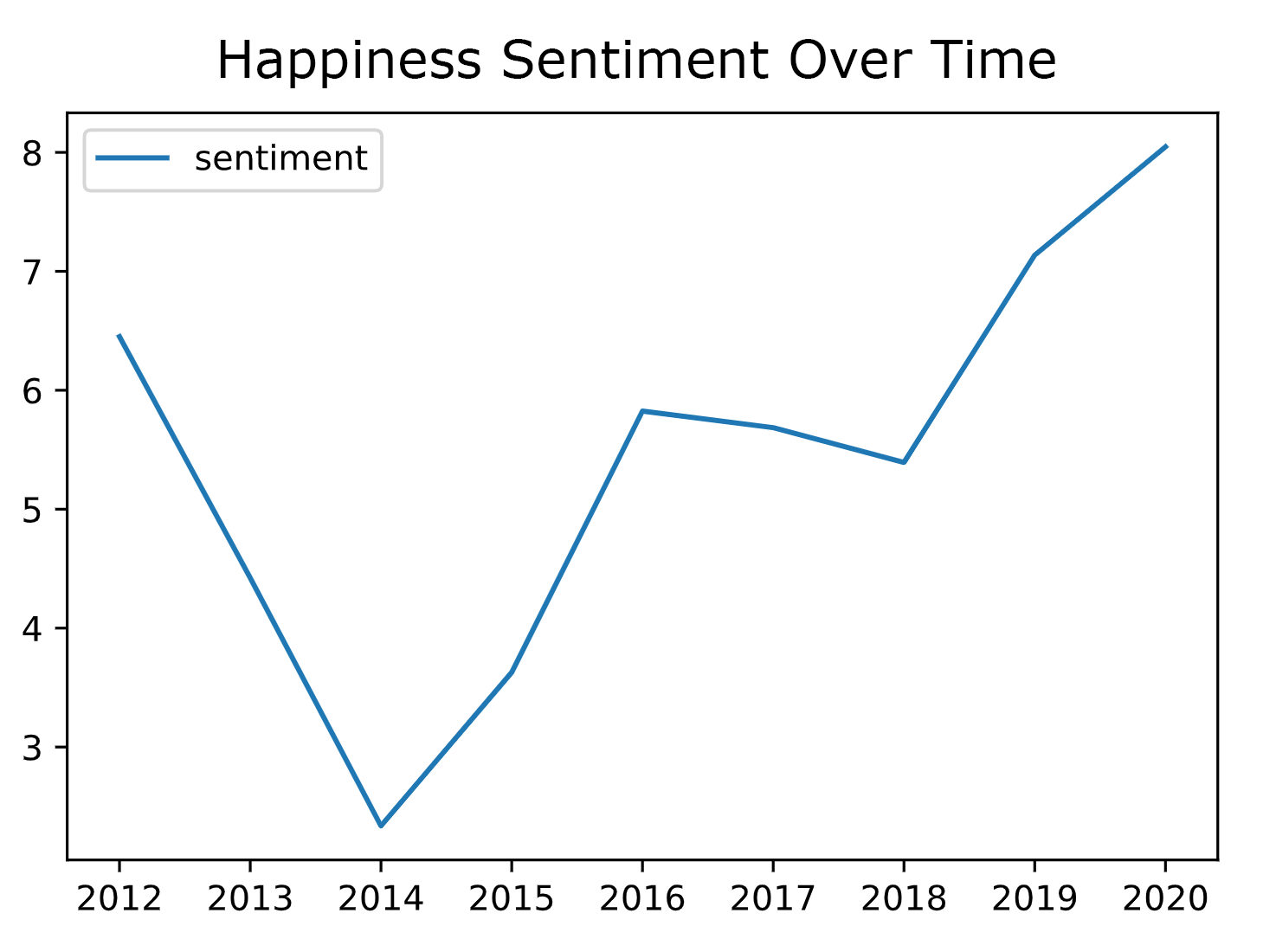
No idea why I was so sadboi in 2014. That was the year I started high school, so maybe that's partly why?
5. Modelling & Relation to CIS545 Material
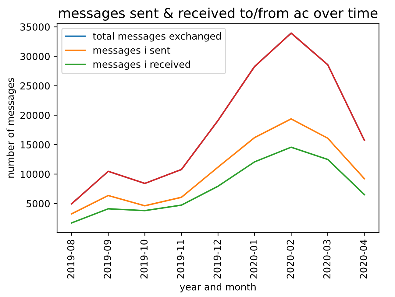
Yay! The last thing I did was create models for my data. I chose to analyze messages between myself and one of my close friends, AC.
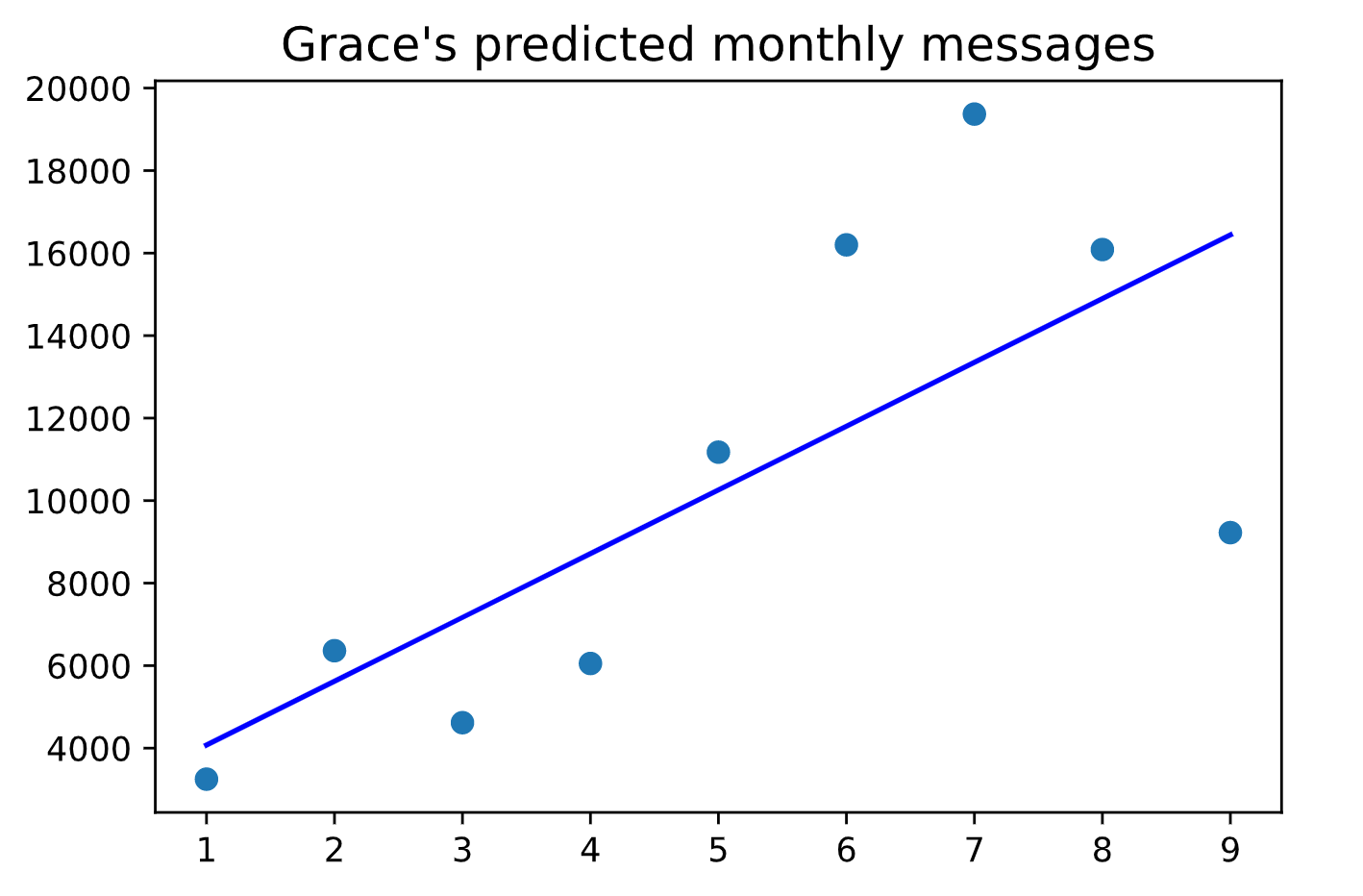
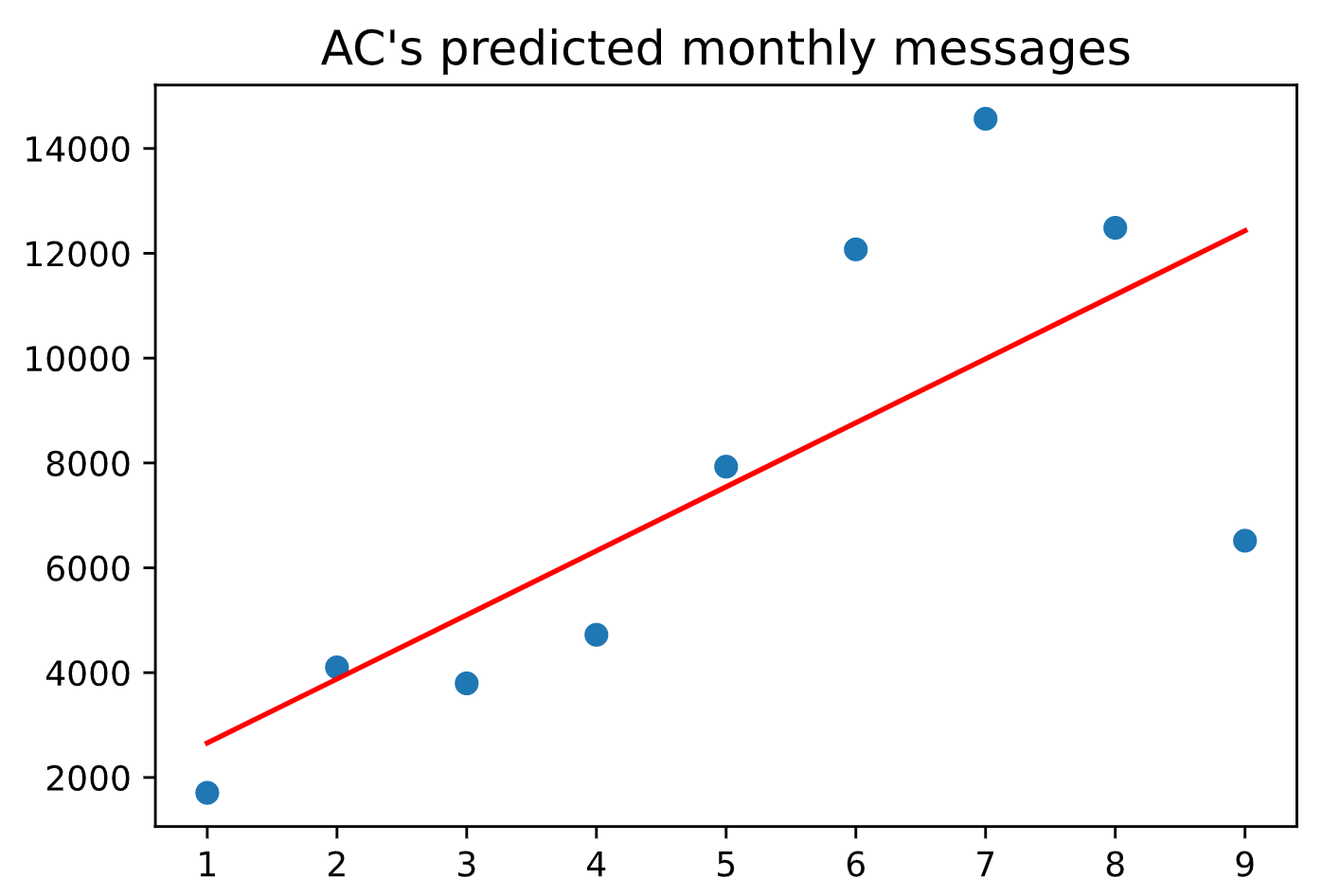
Linear Regression to Predict How Many Messages I'll Receive From AC
Before writing the linear regression for messages between myself and AC, I decided to first analyze our basic messaging trends, using a similar method as part 1.
Messaging Trends
Next, I wrote a simple linear regressor using the library sklearn to predict the number of messages we would send each other this next month.
Code
xxxxxxxxxx# linear regression: simplefrom sklearn.linear_model import LinearRegressionnew_lr_ac_df = ac_df.groupby(['year-month', 'name'], as_index=False).agg({'content': 'count'})def year_in_num(year_month): year = int(year_month[:4]) month = int(year_month[5:]) raw_value = year * 12 + month return raw_value - (2019 * 12 + 7)ac_lr_df = new_lr_ac_df[new_lr_ac_df['name'] == 'AC Bubba']ac_lr_df['time'] = ac_lr_df['year-month'].apply(lambda x: year_in_num(x))ac_lr_df = ac_lr_df.dropna(subset=['year-month'])grac_lr_df = new_lr_ac_df[new_lr_ac_df['name'] == 'Grace Jiang']grac_lr_df['time'] = grac_lr_df['year-month'].apply(lambda x: year_in_num(x))grac_lr_df = grac_lr_df.dropna(subset=['year-month'])ac_X = ac_lr_df['time'].values.reshape(-1, 1)ac_Y = ac_lr_df['content'].values.reshape(-1, 1)lr = LinearRegression()lr.fit(ac_X, ac_Y)ac_Y_pred = lr.predict(ac_X)plt.scatter(ac_X, ac_Y)plt.title("AC's predicted monthly messages", loc='center', fontsize=14, fontweight=0, color='black')plt.plot(ac_X, ac_Y_pred, color='red')plt.show()grac_X = grac_lr_df['time'].values.reshape(-1, 1)grac_Y = grac_lr_df['content'].values.reshape(-1, 1)lr = LinearRegression()lr.fit(grac_X, grac_Y)grac_Y_pred = lr.predict(grac_X)plt.scatter(grac_X, grac_Y)plt.title("Grace's predicted monthly messages", loc='center', fontsize=14, fontweight=0, color='black')plt.plot(grac_X, grac_Y_pred, color='blue')plt.show()
Resulting Linear Regression Charts
I then used a more complex linear regression model based off the one we learned in class.
xxxxxxxxxx# linear regression: more modellingfrom sklearn.linear_model import LinearRegressionfrom sklearn.model_selection import train_test_splitfrom sklearn.metrics import mean_squared_errorimport numpy as npfrom sklearn.decomposition import PCAimport sklearnfrom matplotlib import pyplot as plt from sklearn.ensemble import RandomForestRegressorfrom sklearn.model_selection import GridSearchCVlr_ac_df = ac_df.groupby(['year-month', 'name'], as_index=False).agg({'content': 'count'})lr_ac_df['name'] = lr_ac_df['name'].astype('category')lr_ac_df['year'] = lr_ac_df['year-month'].apply(lambda x: x[:4]).astype(int)lr_ac_df['month'] = lr_ac_df['year-month'].apply(lambda x: x[5:]).astype(int)lr_ac_df = lr_ac_df.drop(columns=['year-month'])lr_ac_df = pd.get_dummies(lr_ac_df, columns=['name'])label = lr_ac_df['content']features = lr_ac_df.drop(columns=['content'])x_train, x_test, y_train, y_test = train_test_split(features, label, test_size=0.2)lin_regressor = LinearRegression()lin_regressor.fit(x_train, y_train)y_pred = lin_regressor.predict(x_test)mse_test = mean_squared_error(y_test, y_pred)
Dimensionality Reduction using PCA
xxxxxxxxxx# Dimensionality reduction with PCA x_df = pd.DataFrame(x_train)pca = PCA()to_train_pca = sklearn.preprocessing.StandardScaler().fit_transform(x_df)trained_pca = pca.fit_transform(to_train_pca)plt.plot(trained_pca)plt.show()evr = pca.explained_variance_ratio_components = pca.components_ratio_plot = np.cumsum(evr)plt.plot(ratio_plot)new_pca = PCA(n_components=4)x_train = new_pca.fit_transform(x_train)rfr = RandomForestRegressor(random_state=4)parameters = { 'max_depth': [2, 4], 'n_estimators': [1, 2, 3]}grid_search = GridSearchCV(estimator=rfr, param_grid=parameters)grid_search.fit(x_train, y_train)x_test = new_pca.fit_transform(x_test)y_pred = grid_search.best_estimator_.predict(x_test)print(np.sqrt(mean_squared_error(y_test, y_pred)))
Machine Learning to Predict Who Sent What Text
Finally, I thought it would be cool to write a machine learning model to predict who sent what message.
(1) Labelling Data to Who Sent What Message
xxxxxxxxxxdata = []data_labels = []for row in ac_to_me_df.content.str.lower(): data.append(row) data_labels.append('ac')for row in me_to_ac_df.content.str.lower(): data.append(row) data_labels.append('grac')
(2) Training our Sets
xxxxxxxxxx# machine learning to categorize who sent the message based off language analysisvectorizer = CountVectorizer( analyzer = 'word', lowercase = False,)features = vectorizer.fit_transform(data)features_nd = features.toarray() # for easy usageX_train, X_test, y_train, y_test = train_test_split( features_nd, data_labels, train_size=0.80, random_state=1000)
(3) Building a Linear Classifier off this Data using Logistic Regression
xxxxxxxxxx# building linear classifierlog_model = LogisticRegression()log_model = log_model.fit(X=X_train, y=y_train)y_pred = log_model.predict(X_test)
(4) Prediction Accuracy
xxxxxxxxxxaccuracy_score(y_test, y_pred)I ended up with an accuracy of around 68%, which is not much better than guessing, but better than nothing.
Conclusion
I've always wondered about my messaging habits over the years, so this has been a project I've been wanting to tackle for a long time. Overall, my findings were about what I expected.
The most challenging part of this project was debugging different syntax errors and figuring out how to do the regression analysis.
My favorite part of this project was seeing the visualizations for how often I messaged my closest friends over the years. I also thought that seeing the wordclouds for the language that I used over the years was interesting.